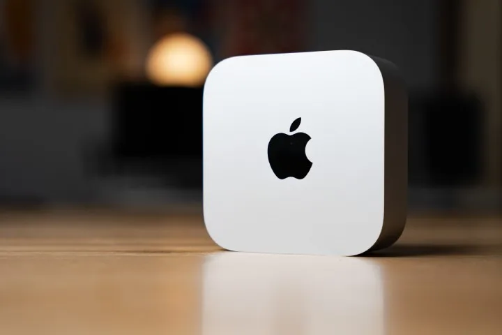
Apple recently announced a new wave of product updates, but not only has the Magic Mouse charging port remained at the bottom of the device, but the power button on the M4 Mac mini has also been moved to the bottom. These design decisions have upset many, but Apple seems to be sticking with the new power button placement on the Mac mini.
In a video posted to the Chinese social media platform Bilibili, Apple’s Greg Joswiak not only defends but praises the decision. He calls it “kind of the perfect place for the power button,” claiming that “you just stick your finger in there and press the button.”
However, according to the M4 Mac mini and many other reviews, there is not enough space to reach the button without lifting the whole PC, and you can’t tell at all which side the button is on. That kind of thing doesn’t just stay in everyone’s memory.

Joswiak also says that “I rarely use the power button on my Mac,” so it seems Apple doesn’t think it’s that important if the button is hard to reach. There’s been a lot of debate about whether you should turn off your computer periodically, but at least we know what Apple is thinking.
As for the actual reason for the button placement, Joswiak suggests that it’s due to size reduction. If that’s true, it seems like an acceptable compromise, but some are convinced that Apple is willing to sacrifice practicality in order to achieve the most minimalist design possible.
If you can handle the power button, the performance the M4 Mac mini offers is pretty amazing for the price.


